Key Takeaways
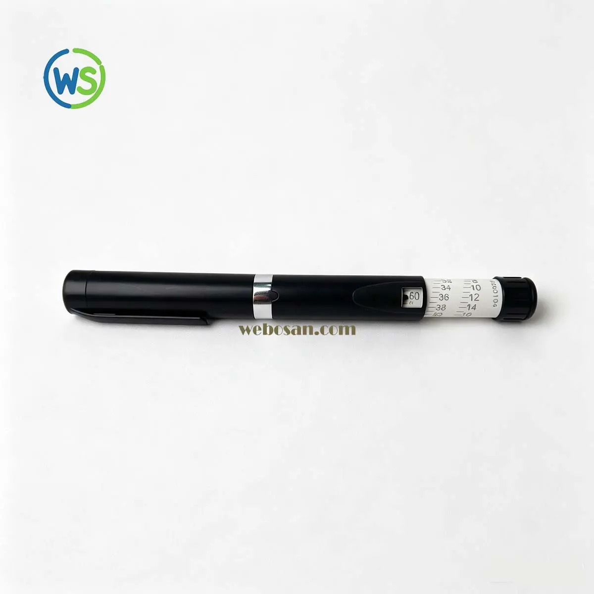
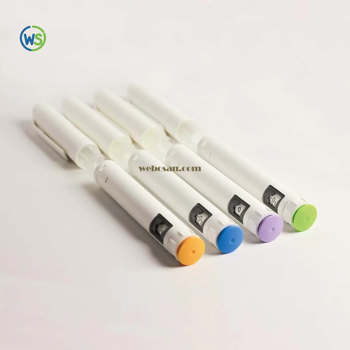
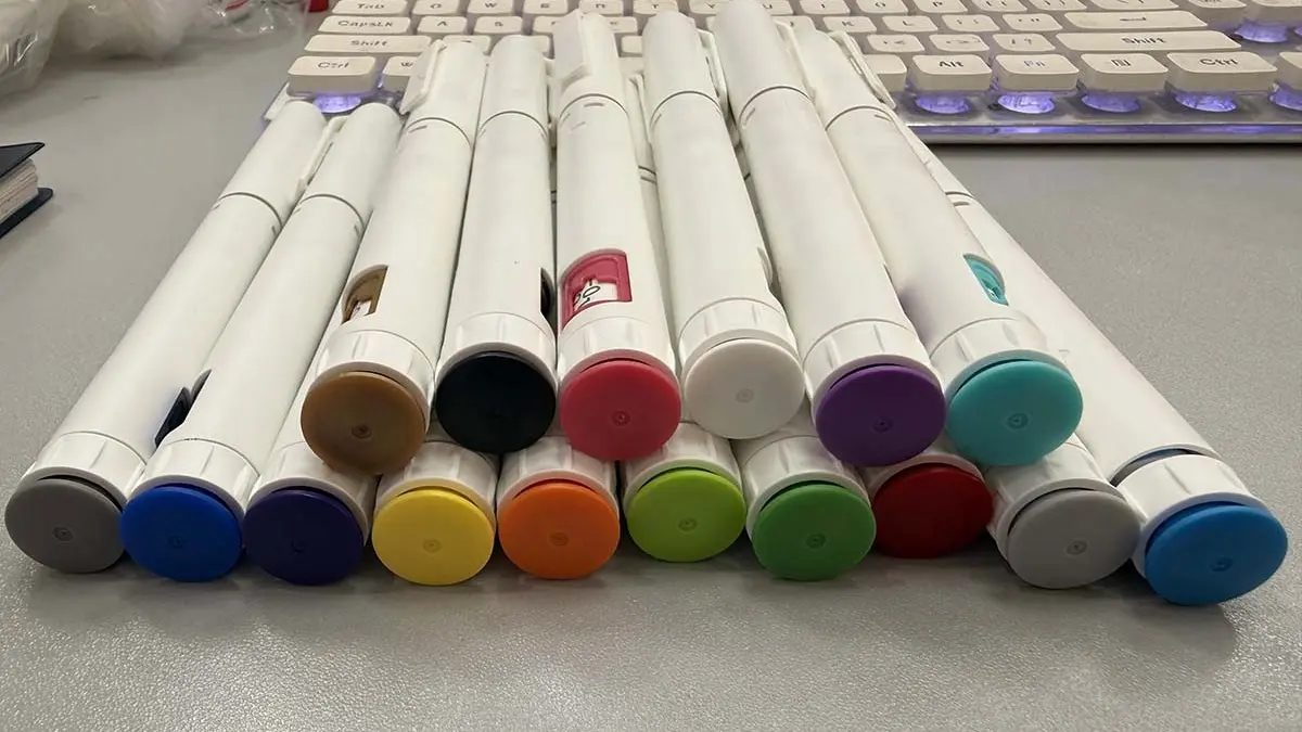
- The WS-DS02 pre-filled disposable injection pen is now offered with a dozen standard end-cap colors, from neutral grey and black through blue, navy, teal, green, yellow, orange, red and purple.
- Color is a cosmetic configuration. Dose range, the ≤ 10 N injection force target, the 3 mL ISO 11608-3 cartridge interface and ISO 11608-2 needle compatibility do not change.
- Buyers use color for dose-strength coding, therapy-line separation and clinic brand presence — but printed strength on the label and IFU must always stay the primary identifier.
- Full body color, custom color matching and brand-panel printing are quoted per OEM project. Send the target color, launch market and annual volume to get MOQ.
Short answer: webosan now supplies the WS-DS02 in a dozen standard end-cap colors, with body color and brand-panel options available for OEM programs. The device underneath — a Class II pre-filled disposable pen built around a 3 mL cartridge — is unchanged.
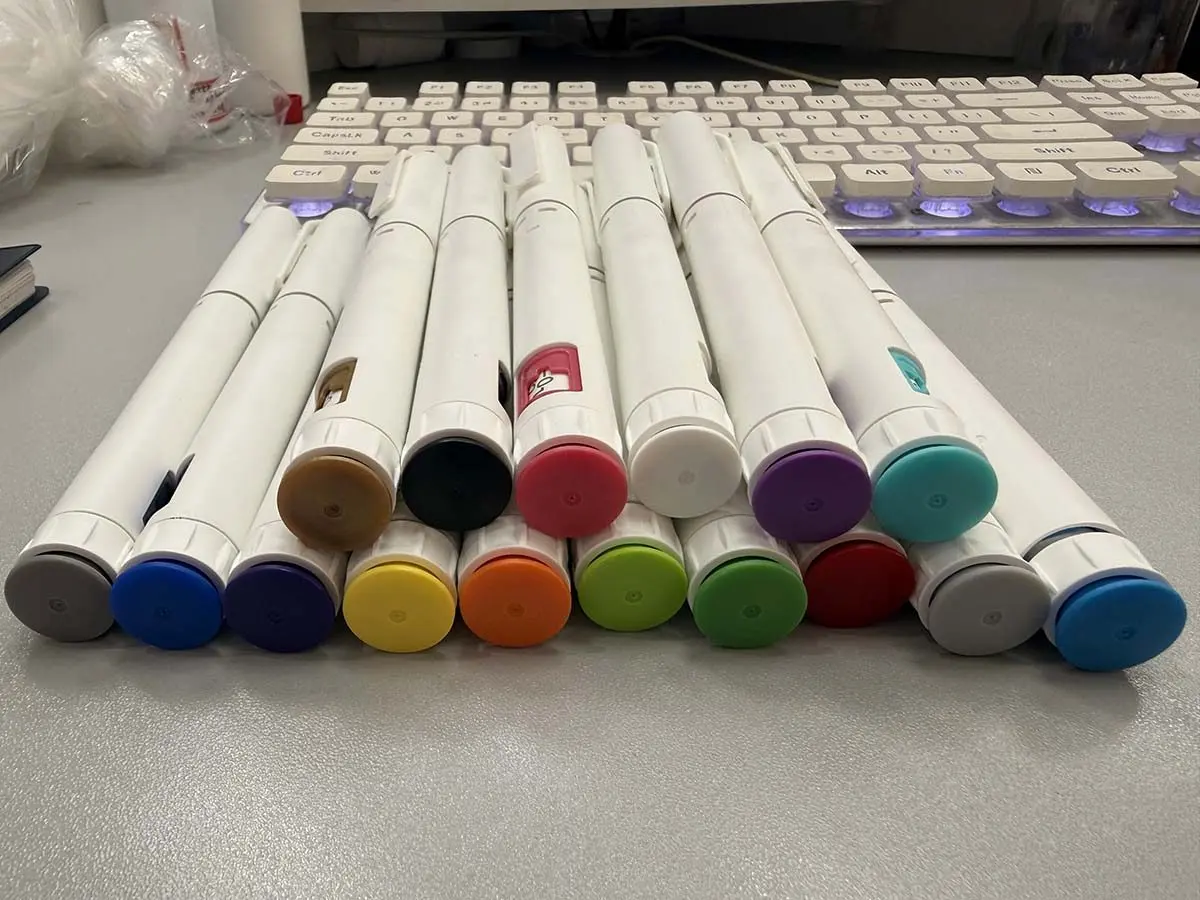
The current WS-DS02 standard palette: one white pen body, a dozen end-cap colors. Each cap is a production configuration, not a rendering.
Why color matters more on a disposable pen than on a reusable one
A reusable pen is bought once and refilled for years, so the buyer usually lives with whatever color the platform offers and puts the differentiation into packaging. A disposable pen is the opposite: it is bought in repeat batches, it is discarded after one cartridge, and it is often the only physical object the patient associates with the therapy.
That changes what procurement teams ask for. When a distributor runs three peptide programs on one device platform, or a clinic group stocks two dose strengths in the same drawer, identical white pens create a real handling risk — not a cosmetic one. Color is the cheapest way to separate them without opening a new tool, a new validation package, or a second supplier.
What the WS-DS02 color palette covers
The color sits on the end cap — the largest surface a patient sees at arm's length, and the part the hand covers during a dose dial. The standard range keeps the pen body white and applies color to that cap:
| Family | Standard colors | Where partners commonly start |
|---|---|---|
| Neutral | Grey, black, tan | Clinical and tender-driven programs where the device should look plain |
| Cool | Blue, navy, teal | GLP-1 and metabolic programs; reads clean in clinic lighting |
| Green | Light green, dark green | Wellness, aesthetic and long-course peptide lines |
| Warm | Yellow, orange, red | High-visibility dose-strength coding |
| Accent | Purple | Brand-led SKUs and premium clinic editions |
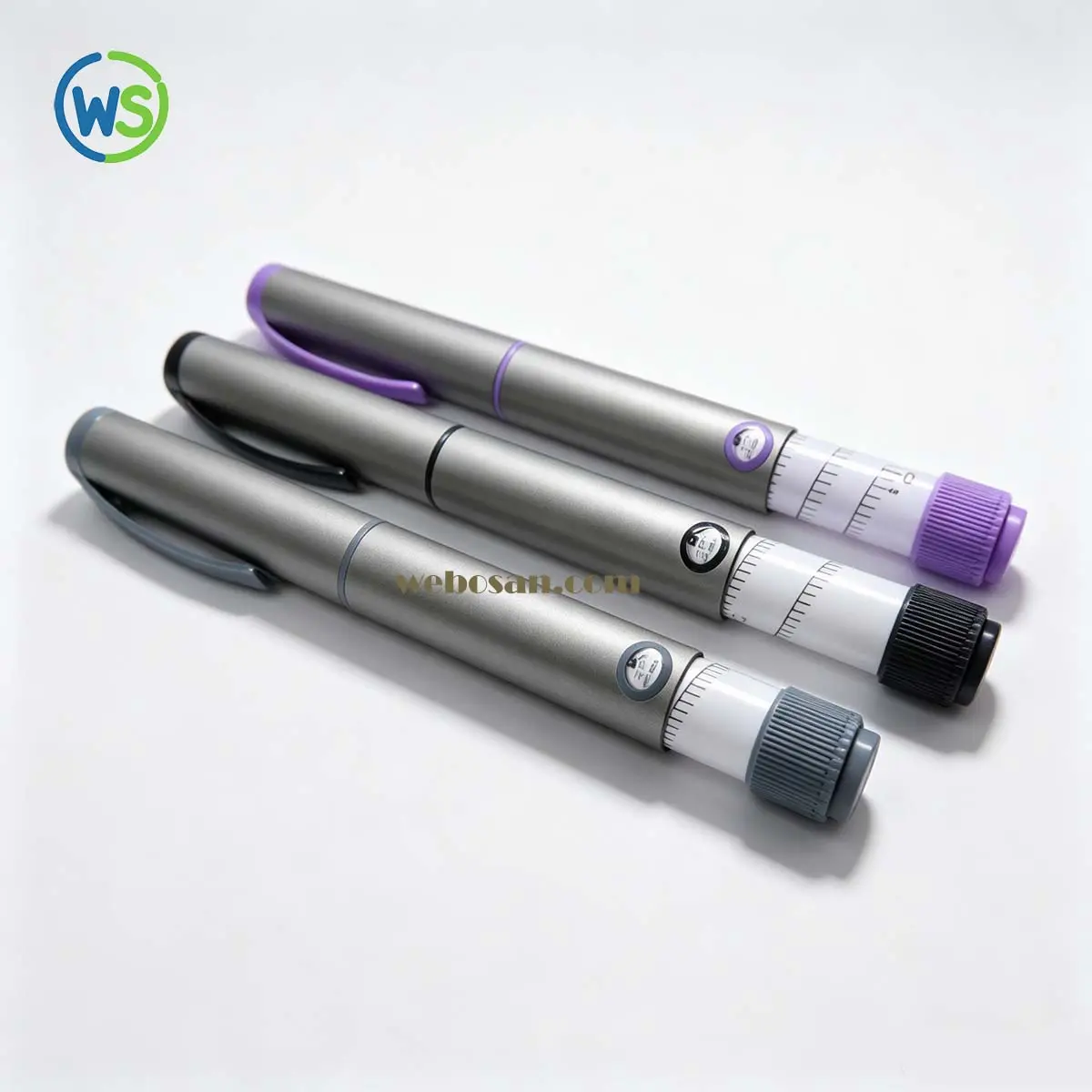
Two options sit outside the standard palette and are quoted per project: full body color instead of a white body, and custom color matching to a Pantone, RAL or physical sample. Brand-panel printing — logo, strength text, market-specific artwork — runs on the same tooling, so color and print are approved together rather than in two separate cycles.
The practical benefit for a catalog is smaller than most buyers expect and bigger than it looks: one photo of twelve pens communicates the whole range, which shortens the sample-request cycle for distributors who need to show options to their own customers.
What color does not change on the WS-DS02
Color is a configuration of the same device, not a new device. These specifications hold across the palette:
| Specification | WS-DS02 |
|---|---|
| Product type | Pre-filled injection pen; discard after the pre-filled cartridge is used |
| Device class | Class II medical device (Category 14) |
| Dose control | Variable metering and fixed-dose configurations |
| Dose range | 0.30 / 0.50 / 0.60 / 0.76 / 0.80 mL maximum, program dependent |
| Minimum dose | 0.01 mL / 0.0208 mL, program dependent |
| Injection force | ≤ 10 N |
| Primary packaging | 3 mL cartridge per ISO 11608-3 |
| Compatible needles | Pen needles per ISO 11608-2 |
Full specifications and downloadable views are on the WS-DS02 product page. If your program is still choosing between disposable and reusable formats, the GLP-1 injection pen supplier checklist covers the selection questions that come before color ever gets discussed.
Three ways buyers actually use color
1. Dose-strength coding. The strongest case, and the one with a safety argument behind it. Insulin has used color plus text for decades; peptide programs are catching up. Red for one strength, blue for another, grey for a maintenance dose — staff pick the right pen from a drawer without reading a 6-point label.
The rule that keeps this safe: color is a secondary cue. The strength must still be printed large enough on the label, carton and IFU that a color-blind user — roughly 1 in 12 men — can identify it without relying on hue. Avoid pairing red and green as the only distinction between two strengths, because that is exactly the pair most commonly confused.
2. Therapy-line separation. One manufacturer, one device platform, three programs: a GLP-1 weight-management line, a wellness peptide line and a hormone line. Different caps let a distributor keep the lines visually separate in a price list, and let a clinic keep them separate in stock, without sourcing three different pens.
3. Market and brand separation. The same WS-DS02 sold under two brand names in two countries does not need two tools — it needs two caps and two label artworks. For clinic groups buying white-label, a cap matched to the clinic's brand color is often the cheapest visible upgrade in the whole kit, cheaper than a custom box.
How to specify color without breaking your regulatory artwork
Color decisions go wrong in the same place every time: someone picks a shade from a screen, approves a label from a PDF, and discovers at sample stage that the cap and the carton no longer read as one product. Four things prevent that.
- Decide whether color is decorative or functional. If color codes a dose strength, it becomes part of how users identify the product, and your label, IFU and training material have to agree with it. If it is decorative, keep that in writing so nobody assumes a safety function later.
- Send a physical reference, not a screenshot. A Pantone or RAL code plus a physical sample removes the screen-calibration argument. Where a code does not exist, we match against the sample.
- Approve cap and artwork together. The cap color sits next to the label color on the shelf. Approving them in separate cycles is how mismatched SKUs reach a market.
- Say which regulatory pathway you are on. Whether a color change needs to be declared depends on your market and your submission route. We provide color and material declarations to support it; we do not decide it for you.
Color consistency across repeat orders
A color that drifts between batches is worse than no color at all, because the clinic notices before the buyer does. Every color is approved against a signed master sample before the first production run. Molded end caps are then compared with that master under defined lighting, and resin lots are recorded so a shift can be traced back to its input rather than discovered in the field.
This sits inside the same process control that governs the rest of the device under our ISO 13485-aligned quality system — the cap is a cosmetic part, but it is still a released part with a released color.
What to send us for a color quote
One email is enough if it contains these six items:
- Target color — Pantone/RAL code, or a photo plus a physical sample we can match
- Scope — end cap only, or body color as well
- Whether the color codes a dose strength or is decorative
- Label and IFU language, plus the strength text that must appear
- Launch market and expected annual volume
- Sample date you are working back from
Send it to sales@webosan.com or through the contact page. If you are still comparing suppliers rather than colors, the injection pen manufacturer guide sets out what a factory should be able to document before you commit to a tool.
webosan supplies delivery-device hardware only. Finished drug products, fill-finish, and market authorisations remain with the pharmaceutical or therapy partner.